Tuesday, 3 May 2011

Evaluation of entire project

In what ways does your media product use, develop or challenge forms and conventions of real media products?
In terms of using and developing key and existing media conventions within video game advertisement, I have incorporated logos and well recognisable development and publishing corporations in order to attract a larger audience for my release. This mechanic often works in all genres of media advertisement and tends to appeal to specific target members of audiences who may be more enticed by one thing over another. For example, gamers who aren’t particularly into survival horror video games may find themselves persuaded to buy it as they see that Valve have developed it, as they are famous for making top quality games with impressive graphics and an atmospheric narrative (e.g. Half Life, Left 4 Dead). I haven’t done so much in the ways of challenging the genre and media conventions as the industry of gaming is fairly new and with its constant prolific nature, anything out of the mainstream stereotype will either not be seen or discarded instantly. Perhaps one of the only ways I have challenged the genre is because I had to use live action actors instead of computer graphics to create it.


How effective is the combination of your main product and ancillary texts?
By using recognisable graphics and continuous themes, such as the images and title fonts, the final pieces all run simultaneously very successfully. The two printed advertisements just the same main graphic and the same placement of titles and images, also I have repeated the same memorable quote from an influential source. The two trailers however are both similar and different, in the sense of the emotion they portray through music and editing, as well as the length of the trailers and the cuts within them. The longer trailer was intended to be more dynamic and cinematic, portraying more of the story and emotional connection, whereas the shorter version was more about the action and thrill within the game play. The 2 songs I used presented these ideas and conflicting needs perfectly I feel.


How have you created a brand?
The creation of a brand is to design and release something that can be easily recognisable and have a following, so in this sense I feel I have made a brand that can easily be accepted into the materialistic world of consumerism. Though the concept of the game have been done many times before, this new approach of co-operation as well as sandbox roaming freedom will stand my game out over other competitors. The title and its font design can be recalled and spotted in advertisements and it’s box art so anybody looking specifically for the title, will be instantly reminded of it. In order to give it an effect of mystery and something to catch the reader’s eye, I loved the use of a man I involved into my title graphic/font, where the iconography of a man hanging from a noose is used as the beginning structure of the letter ‘D’. This on its own can aid the viewer to depict the game genre instantly as terror and horror semiotically.


What have you learned from your audience feedback?
The audience feedback was particularly helpful as I was alone whilst creating all my work, so an outside view was much appreciated. They gave the impression I wanted, that of comical value with a mixture of fear and terror, and some even commented on my camera angles, techniques and perspective which I was very pleased about as these are all done intentionally. Some gave some really interesting points about editing and tips on how my work could have been improved, and I would consider each one if I had more time to incorporate their criticisms into my final piece.


How did you use media technologies in the construction and research, planning and evaluation stages?
Construction:
This is where I would say I used the most media technology as the production of each trailer was done on Premiere Pro editing software, and some of the music and video clips were put through converters online in order for them to work correctly within the cut. All the print advertisements were created on Paint for smaller detail (such as creating the image of the hanging man) and then placed together and minutely edited in Adobe Photoshop. Whilst I was in the process of filming, I created daily video blogs of myself talking about each day’s work process, my aims for the next day and how I felt I could have improved myself and my production. Overall, it has greatly helped me to write my conclusion and remember some points of discussion I would otherwise have forgotten. These were only minimally edited within Windows Movie Maker with the addition of photographs I took over the production days as well.
Research:
Most of my research was conducted on the internet, using Google Images as a main source for both inspiration and case study, but most of my own knowledge came from previous understanding of video games by either playing them or learning about them on the internet or in books and magazines.
Planning:
All of my planning and research work can be seen up on my blog (www.charlottehodsona2.blogspot.com) where I constantly updated any new ideas, new research and final evaluation of each element I worked on. Anything done by hand, sketched or drawn was scanned in and embed into the blog as well. A lot of my work was stored and taken with me on an external hard drive, so I can access my work whenever I was near a PC and had a moment of inspiration.
Evaluation:
The beginning areas of my evaluation took place on YouTube where I sent links to people within my target audience and class to watch my final trailers and leave feedback and criticisms for further improvement. My final evaluation and conclusion, much like all blog posts, was then put through a word processor and pasted up onto the blog as this was the outlet for all of my coursework to be displayed.

Video Production Blog - Day Two

Video Production Blog - Day One

Final Shortened Televised Trailer


Any use of music in this trailer complies with 'Fair Dealing' under the 1988 Copyright Designs and Patents Act (UK), Sections 6(i) and 6(ii); Fair dealing is a term used to describe some limited activities that are allowed without infringing copyright. Briefly these are as follows: Section 6i: Research and private study. Copying parts of a literary, dramatic, musical or artistic work or of a typographical arrangement of a published edition for the purpose of research or private study is allowed under the following conditions: The copy is made for the purposes of research or private study; The copy is made for non-commercial purposes; The source of the material is acknowledged; The person making the copy does not make copies of the material available for a number of people

Thursday, 28 April 2011

Final Full Length Trailer


Any use of music in this trailer complies with 'Fair Dealing' under the 1988 Copyright Designs and Patents Act (UK), Sections 6(i) and 6(ii); Fair dealing is a term used to describe some limited activities that are allowed without infringing copyright. Briefly these are as follows: Section 6i: Research and private study. Copying parts of a literary, dramatic, musical or artistic work or of a typographical arrangement of a published edition for the purpose of research or private study is allowed under the following conditions: The copy is made for the purposes of research or private study; The copy is made for non-commercial purposes; The source of the material is acknowledged; The person making the copy does not make copies of the material available for a number of people.

Thursday, 7 April 2011

Making the Box Art

This didn't take too much hassle to plan as most boxarts are relatively simple and follow a general pattern of codes and conventions. Through my research I generally found that main graphics, title, developer and certification are to appear on the very frontal sleeve, so after editing my advertisement, I didn't hesitate to move the graphic to the other side of the canvas and work straight off it so no differences or anomalies would suffice. It was initially quick and simple to edit into the main graphic and the entirety of the front sleeve, so the next task was adding the contextual information and security details on the back cover. I used 3 more screen captures from my filming to make the game play elements on the background, specifically tailored to emphasize the co-operation and innovative combat methods within the narrative. I found difficulties in writing the blurb for the game as I never considered this during production and I didn't look a great deal into typical methods of description, however my final attempts seem to prove a success. Here was the finale of the design where I needed to implement the address and security/legal details of the game, including a warning surrounding its flashing and enhanced graphical nature. Most gamers will not suffer with said injuries, but it clears up legal difficulties if it is mentioned otherwise. A bar code, certification detailing reasons for particular age concerns and multiplayer/single player campaign and controller setting for those seeking further knowledge of game play abilities. The final piece turned out a lot better than I originally thought as I presumed I would not have enough graphics to put on, or there would be insufficient detail within the writing. The box art is typical of what I would expect to see in stores when I am browsing at games, and I used my own personal experience of browsing to place in the type of descriptions and technological specifics I look for on a games front and back sleeve. Here is my final design.

Making the Print Advertisement

After coming up with 2 initial designs for my advertisement, I settled for a simpler graphological layout as it proved harder than I imagined structuring everything correctly in Photoshop with my limited skills in photo editing. My first task was to create the graphic to be used on both my advertisement and box art products. I used a screen capture from a filmed sequence within the trailer and used Photoshop to enhance the pale skin colour and elongate the teeth into fangs. Using a combination of brushes and colour drop tools, the teeth were satisfyingly sharpened and I then went onto to blur out the background and emphasize the redness around her lips and tongue. Here I edited the skin and flailing hair just a bit more before I moved onto to resizing the canvas ready to layout the templates for the advertisement over the top in a different layer. With the graphic placed and the background cloned across the canvas, it was time to begin adding the templates. I took a long time debating over what fonts to use to accurately depict horror, without it looking too tacky. I ended up opting for a blood red colour with an 'etched' style, followed by blurring out to create a worn out or decrepit effect. The use of a 'hanging man' as the D was a particularly impressive idea of mine, as it really narrows in the idea of torture and pain within the narrative, as well as it being a nice touch for those who notice it. Now with the logo, title and tagline in place suitably around the graphic, the last touches are the release date and graphics for the Development Company, publishers and playable console. These were easy to create as I found them on Google Images and edited them in fluently. I'm really happy with the final product as I think it has a professional finish and it still retains the mystery I want surrounding the advert. As found in the research, if readers of the magazine wish to find out more information about the game and its content, an accompanying website has been supplied. Here is the final outcome.
* Click to enlarge the image.

Monday, 4 April 2011

Research into Boxarts

By using the same video games as I have studied for my print advertisements, I hope to spot similarities between the graphics used and therefore help the continuity and syncronistity of both my advertisements and box arts when I come to create my own. I also plan on looking at key features of the front cover, but most importantly what is on the back in the form of content within the blurb, required specs and legal information as this is actually more vital on the box art than the graphic is. NOTE: All games are available on all consoles (Xbox 360, PS3, PC, PSP, DS, and Wii), so the image will only represent one hardware.

Assassins Creed: Brotherhood
It is firstly important to note that it is a pre-released cover for the game, as can be seen by the ‘Display Only’ notice along the front and the ‘Reserve Now’ heading, however the graphics, layout and content is equal to what is on the actual case. The front demonstrates the same hooded figure seen in the print and televised advertisements, an important focus and recognisable point for audiences to match semiotically. It contains the title, certification and developer upon the front as well, as these are often the 2nd option a potential buyer will look at when considering making a purchase. On the back, a very detailed yet non-spoiler blurb is on the back giving the jest of the games narrative plot lines, with corresponding game play images. Once again, throughout very hyperbolic modifiers are used to amp the excitement of the game and entice a reader to feel enthusiasm towards playing it. Potentially because this is a pre-released cover, no console and game play requirements specs are listed but the address of developers as well as legal information such as the date and trademarks declarations are in small print at the bottom.

Castlevania: Lords of ShadowThis is a better representation of how a complete and released box art cover looks like at it contains far more information on the back page. The front once again contains the recognisable graphic identical to its print advert, and the title, development company and certification. On the back sleeve, the tagline from the magazine advert is placed across the top as an introduction to the following blurb which again outlines the basic narrative story in the game. On this cover, the specs are present and define what is needed or available to do within the game (e.g. ‘Players 1-4’, ‘Xbox Live Multiplayer’, etc) as well as using images to represent game play as well. Interestingly, at the very bottom, the sleeve has a warning about photosensitive sight as the content is featured in 3D effects, this clears up any legal issues with players suffering pain or illness from playing the game. This now also features logos for Microsoft as this cover is taken from an Xbox 360 copy of the game as well as companies involved with sound and distribution. It is important to note that less than half of the back is dedicated to content within the game; the rest is taken up by legal declarations and important technological information.

Call of Duty: Black OpsMuch like the other covers, the recognisable advertised graphic is featured on the front sleeve of the box art, as well as the title, certification and development company logo. This back however features larger images and less textual blurbs, potentially because of popularity surrounding the game, not a lot actually needs to be said to entice its potential buyer. Again it features technological specs (e.g. ‘Players 1-4’, ‘Network Playing’, ‘No Video Output’) and it also features a warning for players as a lot of the scenes contain brutal amounts of explosions and flashing lights. Lastly, legal logos and declarations are made at the bottom in small text.

Halo: ReachI could not find the full sleeved image of the box art anywhere on the internet, but the front sleeve demonstrates the point I aim to make by looking at all my research images. The front cover still displays the iconic image as advertised and published months before its release. By using this graphical emblem, players upon entering a store can instantly recognise the game they want and are aware of its content and its representation. All covers are simply designed, with the title across the top, developer in the bottom right corner and certification in the bottom left corner, leaving the graphic to take up its maximum potential space as this is what catches the audience’s eye. The specs as seen along the top this time however demonstrate some of the key technological information you could read later on the back sleeve of the box art, portraying the game as ‘Only on Xbox 360’ and ‘Xbox Live’, meaning it is playable online. The main goal of the front sleeve is to attract the audience, give it key purchasing information such as the certification and allow the audience to make their mind up about turning over to the back and finding out more, or simply putting the game back on the shelf.

Tuesday, 29 March 2011

Planning Designs for my Advert

Before I begin to decide on my graphics, title, logo and other aspects needed in my print advertisement, I began to consider the layout of them, so when I decided upon the content, I had a clear idea of how they would slot together. The best way of deducing the perfect outcome was to mock-up a magazine advert using different elements of my research adverts, with my own twist on them.

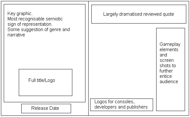
Basic Idea - 2-page spread.This idea is the most simple and straight forward of my two potentials; it follows almost the exact same layout as the Call of Duty advert, however I have chosen to manipulate the blank space that they left. Once again, I have the key graphic filling up the largest area possible on the left side, with the title underneath. This is under the idea that the game I am creating is potentially an incredibly popular one; therefore all the audience needs to see is the left hand page to be drawn into the product. The right side contains far more information and in-game features than all 3 of my examples as in my own experience I prefer everything I might need to know to be in the advert in front of me, I often won't go looking for more information unless I was anticipating the game greatly. I was considering the involvement of the game play footage on the far right panel, as I didn't know if I would have the space or content to fill them, but it's a definite inclusion if I can find the corresponding game play demos.

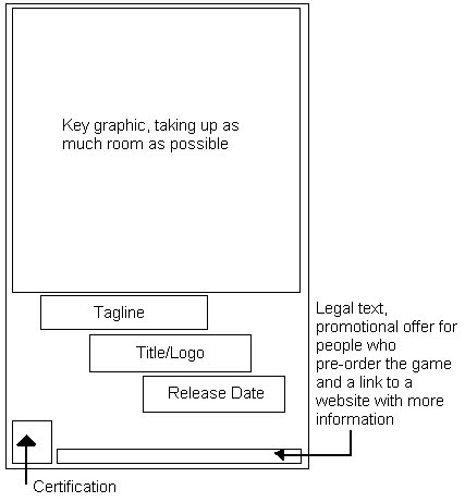
Basic Idea - 1-page spread.Though this advert is only printed on the one page, I want it to contain the same mystery elements of the Halo advertisement I studied. Once again, there will be the large key graphic, title and release date, however this time I plan to involve a tagline to add a sense of horror or tension as the text will only feature as the smallest form on the advert - the main focus will be upon the graphic. This advert unlike the other will contain certifications as it is purely about the RELEASE of the game, and not the game play and review of it; it leads the audience to their own conclusion of the games appeal. Sharing the same idea as Halo, this advert will offer rewards to customers who pre-order or buy special editions of the game, once more this advert is purely for the consumer’s interest and not for marketing and profit.

Though this advert is only printed on the one page, I want it to contain the same mystery elements of the Halo advertisement I studied. Once again, there will be the large key graphic, title and release date, however this time I plan to involve a tagline to add a sense of horror or tension as the text will only feature as the smallest form on the advert - the main focus will be upon the graphic. This advert unlike the other will contain certifications as it is purely about the RELEASE of the game, and not the game play and review of it; it leads the audience to their own conclusion of the games appeal. Sharing the same idea as Halo, this advert will offer rewards to customers who pre-order or buy special editions of the game, once more this advert is purely for the consumer’s interest and not for marketing and profit.

Basic Print Advertisement Features

Based on the 3 research samples I obtained and analysed, a trend seems to follow in the form of what is VITAL on a print advertisement. Here are some mock-up forms of the examples I have collected, and what features are within them and where.

Call of Duty: Black Ops
The most important graphological aspect of this advert would be the key graphic and the title, perhaps because of the video games popularity and hype, any audience would of seen this and been instantly captivated as our eyes tend to look in the top left hand corner of texts first. Interestingly, on the opposite side of the advert, there is a large empty space, which could possibly be used to emphasize the graphic or to draw more attempts to the large font above it reviewing the game. The logos for consoles and production companies are typically small and are at the bottom right of the advert, where the eye is drawn to lastly.

Castlevania
As this is printed on the one page, the same about of legal content is required to be squeezed onto the one feature. However, they have still most importantly got a large area for the main graphic. The traditional 'tagline + title' are bundled closely together with the release date as these are next on what an audience would look for information-wise, but what is noteworthy with this feature would be the separation of the developers logo from the bottom segment. This is a common theme for Konami games as they are a specialised Japanese games developer and often is quite sought out by fans; this is perhaps a method to attract fans of the developers, not just the game series.

Halo: Reach
Out of the 3 this is the most intriguing for me, from a design perspective as well as a content one. Most of the advertisements have large graphics and enough text to fulfil an audience’s need upon reading the advert. However the Halo one features purely an extremely large graphic, the title/logo and small bursts of text across the bottom. Much like the Call of Duty advert, the graphic is the key feature of the entire piece, as the icon is globally recognisable. In some senses, this advert could be seen as lacking as it doesn't meet the requirement to help the reader again knowledge on their product, but what it does achieve is mystery and a want to find out more, so therefore they have included a website for these seeking more. For me, this is perhaps the most interesting print advertisement of them all.

Monday, 28 March 2011

'Castlevania' Print Advertisement


* Vital Elements
Once again, the advertisement features the most important elements much like the previous (title, classification, release date, publisher/developer), however it is important to consider that the advert is only featured on one page. In comparison to the other titles I have studied, ‘Call of Duty’ sold 5.6 million copies in 24 hours, Assassins Creed: Brotherhood sold 6.5 million copies in one week, and lastly Castlevania sold only 1 million copies in just over 2 weeks. Because of the time of release being directly in the middle of 2 very popular game titles, the advertisers knew not to spend overt amounts of advertisements as it would not all pay itself back. Game play elements and quotes can be seen on this feature as it is purely for marketing and popularity boosts, which successfully managed to place it 7th amongst the ‘Most Anticipated Games of 2010’ list on the admired video game content website, Game Trailers.
* Representation
Visual semiotics suggest a represented time period within the 11th century, allowing the impression of old cultures and historically epic narratives to feature fantastical elements of magic and heroism within the game. The masculine lead at the head of the magazine advert boasts a gruff and angry expression and when keyed with the title ‘Lords of Shadow’, the construct of a male orientated representation is suggested.
* Genre
A stereotypical fantasy RPG (Role-Playing Game) because of its combat and levelling techniques, with a further developed idea into adventure and strategy. Though clearly aimed at a male audience, the purpose of the release is to reboot the old Castlevania franchise back into popularity as it once was. This then has primary focus on old fans of the game, as well as attracting newer players with experience within heavily medieval archetypes (Dungeons and Dragons, Elder Scrolls)
* Narrative
The game play screen shot along the bottom of the advert suggest a hand-to-hand or flourishing weaponry style combat game featuring methods of tacticality. The visuals in the advert imply epic battles and quest lines, based within a beautifully picturesque environment – a wholly stereotypical narrative plot for fantasy RPG games. The advert shows no rewards or blurbs for potential customers and no content other than game play screen shots, so it’s solely for media attention.
* Audience
Much like the Halo advert, no large text is involved to persuade the reader into becoming a buyer, just flashy visuals and graphics. This is most likely down the concept behind it being a reboot, as the developers want to show signs of maturity and expansion from their previous game, however research into the title shows that the game itself has minimal links to the previous games. Cleverly, this attracts old fans of the genre, as well as new customers as they are not left in the dark by missing out on the contextual knowledge others might hold.
* Media Language
The reviewed quotes along the top ultimately indicate the games modern approach to innovation, like previously mentioned (‘genre-defying’, ‘3D’). One of the key marketing schemes of the game was to boast the profile surrounding its 3D capabilities as it was one of the first games to ever attempt and successfully release a 3D optional title. It’s also important to notice that the quotes are taken from 2 of the most respected gaming magazines on the market, as their professional opinion would be influential to potential customers – Official Xbox Magazine (which this advert was featured) and Playstation Magazine 3. Within the taglines of the game, ‘repetition of the word ‘dark’ suggests a fight against morality and justice, once again highly typical for a fantasy game. The layout of the advert defines the character as locations as primary elements of the games and centrally key to the plot.

'Halo: Reach' Print Advertisement


* Vital Elements
This advert contains the requirements for a full title and release date, certification and logos for its platformed console/developer/publisher, however does not offer a reviewed quote from a respected magazine or person. This is because the game has not yet been released to the public, or even to reviews, so instead a blurb is detailed along the bottom to set-up the narrative within the game. No game play clips allows the audience to become further mystified by the advertisement as they know nothing from inside the game, allowing for ‘buzz’ and interest to build.
* Representation
Gender placement can be seen as difficult to label as the figures in the advert are in space suits, however their key features model their masculine body builds as well as boasting large and powerful weaponry. Through the study of Semiotics, other focus signs such as their description as heroes in the ‘Noble Team’, suggest a hier-achetypal male idol with great power. By using an unfamiliar location and sci-fi-esque character types, the audience is drawn into its pseudo-reality and somehow finds their own representation within it. Though no narrative elements are portrayed, more semiotical signs evaluate the famous ‘Master Chief’ character, as well as the space environment and ‘Halo’ logo so old fans can instantly recognise the newest release. Aimed at a predominately male, potentially off the back of other popular FPS titles such as ‘Call of Duty’, the new addition of a female character in the advertisement opens the new representation and audience to females.
* Genre
In terms of direct Taxonomy classification, Halo: Reach is an ultimately an action game, which can then be subcategorized into adventure/shooter or even strategy. It’s seen as an ‘FPS set in space’ as the characters are wearing alien-style suits of armour and out-landish guns. Former Halo enthusiasts will be drawn to the newest title of the most successful video game series because of its similarities to past titles, however through explosive use of visual action and adventure in the advertisement, new fans can begin to expect what the narrative will entail.
* Narrative
As suggested by the genre, the narrative will involve various degrees of action/fighting and potentially co-operation as a ‘squad’ of soldiers can be seen. By reading into the smaller texted blurb and learning the idea of playing as part of a team, the advert becomes purely for narrative constructs and not so much marketing. As barely any new information for fans is deployed, it can be considered that this advertisement is to cause buzz and hype just through the mere suggestion of a new Halo title.
* Audience
This advert was scanned from the popular gaming magazine OXM (Official Xbox Magazine), which features Xbox exclusive content only. The appearance of this advertisement is strategically placed as Halo: Reach is an Xbox-only title, so it’s large, double page spread will directly influence customers who have shared contextual knowledge of the game. Because of the ‘entertainment’ value of the magazine and gaming industry, the advert aims for casual but content specific audiences, so the advert features no large amounts of text, just impressive visuals as an aid to purchase.
* Media Language
The use of hyperbolic modifiers to excites the reader(‘legend’, ‘overwhelming’, ‘elite’, ‘massive’) gives the audience a deeper and more enthusiastic anticipation to discover more, and for this a website address is provided for those seeking more information. Rewards in the form for Halo fans who pre-order the title entice a specific fan base and audience. Most importantly, the legal text below aims to protect claims within the advertisement, as well as the signs and logos used.

Monday, 14 February 2011

'Call of Duty' Print Advertisement

As I will consider the narrative, structure and final versions of each of my 2 trailers right at the very end, I will take this opportunity to begin work on some of the other key elements needed for this project:
a) Print Advertisements
b) Box art, for all hardware consoles

Considering first, will be the print advertisements. I have gathered a collection of popular advertisement schemes from some of the top selling and most promoted games of 2010, as these demonstrate the better quality and range of what a publishing company can achieve. The first of these will be the record breaking and potentially the most 'sought-after' video game of all time - Call of Duty: Black Ops.


The game was released worldwide on November 9th over all 4 major console systems; this therefore needed a large scale advertisement strategy - that easily paid itself off. Within the first 24 hours of its release, the game sold in excess of 7 million copies, smashing the previous record of 2.5 million beyond argument from preceding record holder, Call of Duty: Modern Warfare 2. This in no short way is all thanks to the CEO of Activision, Bobby Kotick, who openly stated that 'Black Ops’ will see a larger financial investment by the company than any other game that they have ever released', with a rumoured $100 million budget placed solely on marketing.


The print advertisement was more often than not seen over a 2-page spread, allowing the entire audience focus to be primarily on the game. Up to 6 months before the release of the game, the symbolic image of the man wielding 2 pistols was surfaced on secretive sites, and mailed to high priority status publications and video game players. This in instead gathered its own momentum as fan of the game began to speculate the release of another Call of Duty title, somehow allowing the game to begin its journey into its own marketing for free.


The vital elements of the advertisement are as follows:
* The FULL title of the game, though the game and its previous titles are all simply known amongst the gaming community as 'Call of Duty' or 'COD', the need to reinforce its name was necessary, as the game was facing a Christmas release and many buyers may of been a parent or guardian, as in fact the largest played demographic for the game is normally under the certification
* A short, quoted review about the game from a well respected gaming publication, in this example being 'GAMESMASTER'. Often this will have no relevance or description of the game itself; instead it normally holds a hyperbolic property of being exclamative and over exaggerated. Often holding very bold claims or statements, this is no different as it is being described as having the ability to 'rule 2010', regardless of other pre-releases or the overall opinion of the gaming market.
* Appearing mostly on larger spreads, as the release date draws closer, screen grabs of game play is featured on the advertisement with key elements enhanced within the game - perhaps it’s innovative and cutting edge new graphics, engine or plot. This advert however focuses solely on the multiplayer aspect of the game, as it is widely known as perhaps what the players really pay for when they purchase the game. It has itself broke records and is considered the best multiplayer experience for gamers for this generation- once again, a bold statement.
* Lastly, the most important and legal features of the certification, the consoles it will appear on (this was advertised in the Official Xbox Magazine, so only this logo appears), the developer (Treyarch) and the publisher (Activision).


One thing I can notice from the advert is the lack of information and knowledge on itself, a ploy to aid further consumers onto the website noted as well as doing further research of their own. This inevitably created a huge buzz in search engines, allowing the key word 'Call of Duty' and 'Black Ops' to dominate the Google Trend chart for up to 2 months before and after the release.

Photobucket
This timeline from Google represents the sheer scale of publicity and attention the game created around itself. The first notable rising in the scale were surrounding the release of the intention of creating another Call of Duty game as the popularity of Modern Warfare shattered records. The next few steady months were as the title was released and gradually more information was streamed into the waiting public, up until the momentous rise at the end of the year when the game came out.

Tuesday, 1 February 2011

What's Next...

Now I have began and finished at least 80% of my filming for the final video-based advert, I need to consider further means of advertising my game to a wide audience. As I have now the indefinite cuts and scenes to utilize in my 3-minute length trailer, I can begin to plan a shortened version of the trailer, as well as concepts for the box art and magazine advertisements.

Below is a case study into the overall advertisement into the 2010 release of 'Assassins Creed: Brotherhood':


This 2.42 minute long trailer was first released at the E3 Video Game Convention in 2010. The game came out just a few months later, but for press, fans and critics this was the very first they saw of the new release. It shows no hints towards major game play elements, instead it is rather ambiguous in what it does display knowledge wise. This therefore generates a large buzz around the game. It is far more theatrical and the quality of animation is barely distinguishable from actual real life recordings, which is highly impressive.


This much shorter trailer however is what was advertised on TV in the 2 months running up to the world wide release. The animation is now replica of game play footage and displays dense examples of skills and tactics that will be deployed throughout the plot. It is final excitement for fans as they now have a better grasp on the game soon to be released and hooks them in to buy the game.

Photobucket

This is a feature for the game on a majorly popular gaming magazine, where it featured a massive spread on the narrative, production and even a review/preview. It gained a large amount of publicity and in fact this kind of coverage can really make or break a game with impressive circulation figures of 70,000 in the UK and up to 425,000 in the US.

Photobucket

This was a very bizarre form of advertising as it features the Limited Edition copy of the video game software, and was more commonly seen than a more basic structure simply advertising the release. However this can also be explained when considering that the fan following behind the huge game series allows them to push the sales upon a more expensive edition of the game, as they know it will appeal to the greater interests of the masses - a very strategic move.

Photobucket

This is not advertisement of the game, but instead the final box art that was used on the cover of the software. It displays the commonly used logo and themes based from all of the trailers and magazine features. It displays the developer, publisher, certification, system requirements and even further information such as a blurb to the narrative and information about the online multiplayer. This is typically the type of box art you would see from a video game, and it does not break conventions of ambiguity and unknowing.

Monday, 6 December 2010

Call Sheet for Production Management

Production Title: *Working Title*
Shooting Date: Running over multiple days in December/January
Location: Areas in and around Dorchester
Location Address: Dorchester, Dorset
Initial Meeting Place: (If applicable) In Dorchester, or at pick-up points near specific filming locations as pre-planned


PRODUCTION TEAM
Producer/Director/Production Assistant:
Charlotte Hodson - 07949992451


PRODUCTION CREW
Camera Operator:
Charlotte Hodson
Sound Recordist: Charlotte Hodson
Lighting: Charlotte Hodson
Assistant 1: Caleb O’Neill - 07912366915


TALENT/GUESTS
Name: Laura Baney - 07792592293
Name: Will Boyes - 07795275590
Name: Tiffany Eccles - 07528737299
Name: Caleb O’Neill - 07912366915
Due on Set: 5.30pm until finished, approx filming time of 2-4 hours.

DAYS AVAILABLE FOR FILMING:
December: 7th, 9th, 11th, 12th, 13th, 15th (break up from College on the 17th, equipment not available to borrow)
January: TBC

Monday, 29 November 2010

Ideas for filming location

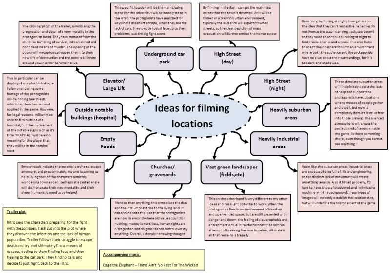
I predominately want to denote the idea that the zombie infection within the game is not just affecting the protagonists, but in fact their entire surroundings. The involvement of derelict environments and silent high streets is as unfamiliar to anyone as it is harrowing.


The use of buildings with a dilapidated appearance will physically enhance the terror and abandonment the human race had to face during the destruction of their lives. Though the trailer will not portray interiors of these chilling locations, the outside enough will demonstrate a particular use for them within the game play structure.


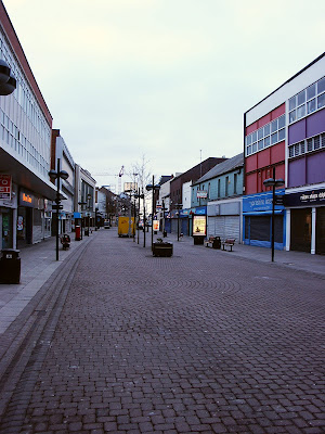
In particular, I want to show the desolate environment of ideologically 'busy' high streets, they reinforce a traditional urban environment, but their lack of movement and commotion once again will portray the devastation left behind from the outbreak. The protagonists will play a huge amount of time in these locations within the game as this is where they meet pawn brokers in which players can purchase amenities and upgrade for their characters.

The empty and abandoned car parking garage is a particular favourite of mine. It will be featured in both the opening and the closing of the trailer as the characters go through a flash back. It symbolises their desperate struggle to escape the world they are now trapped it, and when they reach an area where they plot all their hopes within, to find it empty and still, it destroys their final morality. It opens up the main unit of the game, the fighting and murder of zombies, so it's very important. It also embodies the idea of claustrophobia as the heavy concrete walls seem to block out the sun and outside life.

Click here to see my brain storm for potential filming locations, and my interpretation of them according to the narrative of the video game.


All images taken from Google Images and are not my own photographs.

Monday, 15 November 2010

Audience Analysis

Understanding
When video games are regarded as a purposeful consumer product, it is considered that video games are purely a feeling of escapism and a definite form of ‘hyper reality’. Following this idea, the audience needs to understand and respect that video game content is not exact representation of real life events/relationships and that logical legal and ethical values need to be considered at all times. For example, when Rockstar developed and released the game ‘Grand Theft Auto’ in 1997, nothing but controversy and public hatred ensued because of its in-game disregard for all moral and lawful behaviour. The player could pick up a prostitute, take her out into an abandoned area, have sex with her and then brutally murder her to get your money back. And when the idea that you could run over hundreds of civilians with your car and the police wouldn’t care is implimented, anger sparked in parents as they watched their children play.

'Grand Theft Auto' allows you to shoot at civilians and evade the law, as you become part of a notorious crime ring in USAs major cities.

But it is this kind of understanding that gamers need to be aware of before they begin playing a game; what happens in a fiction setting with fiction characters and an imagined plot are only for video games. Especially with games that come with a mature rating, audiences need to take into account what they may be witnessed to over the course of the game, and that when they turn off their consoles, that some of the behaviour you just had the ability to it is not accepted in real life. This in particular is why my video game will be branded an 18. My ‘survival horror’ genre allows audiences to predict its terrifying gameplay nature as well as its strong use of blood and gore, so this means that those who cannot interpret its difference from reality can avoid the title.

The worlds most controversal video game scene; 'Call of Duty: Modern Warfare 2' sees the player being forced to become a terrorist in an airport by shooting at innocent civilians. The press links the horror and terrorism in the scene to the terror attacks in Mumbai just a year before.

Interest
I believe that my demographic audience would play my game as the ‘zombie’ genre is increasingly popular recently thanks to the release of ‘Resident Evil 5’ and ‘Dead Rising 2’. As well as this, the ability to play a game in your own pace and get to the end when you’re ready and when you’ve discovered every single thing the game has to offer means that many people will find the game more immersive and emotional than other titles that feel too linear and scripted. As the game will be set in modern times in a relatable environment, the player can involve themselves completely into the situation without having to consider archaic traditions, for example, war games may need a level of understanding of the time period in which they are playing in.

'Left 4 Dead' shows the popularity of zombie-based video games as the original and its sequel have sold up to 6 million copies over the last 3 years.

Environment
Based on knowledge that most of the audience I’m aiming at is now online and deeply immersed into Web 2.0 technology, small viral videos will be widely released, and will be previewing on YouTube, my own personal website as well as on TV after the 9pm water shed. This will then cause mystery and spark excitement from people who are interested in the game and therefore a need for discovery will be around the games release. About 2 weeks before the official world wide release, the full length trailer will be released on the same TV channels as before, and the advertising posters will appear in bus shelters, magazines and radio slots over the main release countries, the UK and the USA. I plan to have advertisements in these specific and varied environments because gamers are a part of everyday life. Some hardcore gaming fans will buy gaming-specific magazines and will see advertisements there, but for others who are not so deep into gaming can see the advertisements elsewhere, and I can attract their attention this way. By having the adverts only premiere on TV after the water shed it will reinforce the idea that the game will be a mature contented one, and that only older viewers will be able to play it.


'Fallout New Vegas' was advertised on the side of buses specifically in Las Vegas.

Audience Profile

As far as video game developers and their receiving audience go, games can be split into further categories outside of their PEGI classification and content warnings. One of the most important things to consider is the mentality of the audience you’re aiming it at, for example a mindlessly gory and violent game could be mentally disturbing for a young child, and oppositely a trigger-happy adult may not enjoy playing a game involving the grooming of farm animals. Along with this is the consideration of other receivers around the player. For most children, the enticement of an 18 certification game means that they hold rebellion over their parent and the publishers of the game by defying the age restrictions and playing the game, and some parents are more than happy to buy it for their children. Whereas others may not be so happy to comply and feel that attempting to attract and entice this audience is completely incorrect.


Based on the content warning and age restrictions present on my video game box cover, my audience demographic factors will be:

· AGE: Judging from the extreme violence and mature content, the game will no doubt serve an 18 rating, meaning that only peoples over the age of 18 may buy it. But statistics show that more often than not, those age-legal people are just buying the restricted title for their child who could not purchase it themselves. This does make a mockery of the entire certification process, but no doubt enhances sales. Preferably the age range for my game would be from 18-40, but as I cannot stop sales to parents for their children, the demographic average may be lower than expected. According to a survey conducted by the ESA (Entertainment Software Association) in 2008, the average age of gamers is calculated to be 35.

· GENDER: As my protagonists are both male and female, the game will not deter either one of the genders. However the content may discourage some females meaning that a higher proportion of males will buy it, but it is known now that the ratio of gaming genders is 60/40 to males/females.

· SEXUALITY: There is no nudity or sexual content within the game, however the female character will be dressed in complimentary clothing with the male imagine in mind. Strong masculine personalities will be swayed more onto hardcore game genres, such as shooters and fighting titles, and ideological feminine sexualities will prefer genres such as family/children’s entertainment or adventure


· LOCATION: The game will be set in a tradition urban city, and therefore will be recognisable to all major audiences. In terms of the buying audience, a game aimed at ideological for American and English games is the most preferable as these are where the highest majority of video game sales happen, whereas in Australia a lot of games with strong content are banned.


· OCCUPATION: Both protagonists will be of a young adult age, ranging between 25-30, which will no doubt be reflected in the audience demographic. This places the player within a age where a job would normally be expected, as well as a home and a mortgage. This means a lowered chance of frequent playing hours and hardly any time spent online. The other half of my audience will be students or unemployed, so long hours of game time as well as online interaction will take place.

Tuesday, 9 November 2010

Character Development

Male protagonist: The focus character with whom the audience will relate to the most. Middle class social representation according to his house in the beginning and his accent. Well build masculine lead with courage and bravery, though suffers from moments of weakness upon remembrance of his family. Loosely based on previous video game characters such as Marcus Fenix (Gears of War) and John Marston (Red Dead Redemption) for their need of revenge and order, but their strong social and ethical morals.


Female Protagonist: Optional playable character, but present from the middle until the end of the game. Comes across as an independent and strong woman, with a high social class but a rebellious nature, the audience soon finds out her upsetting past of domestic abuse and homelessness. This draws the audience’s emotions into hers and the two protagonists begin to get closer, and then we find out her secrets. Very dramatic and sarcastic humour, lights the mood throughout the game. Loosely based on Rubi Malone (WET) and Lilith (Borderlands) for their liberated attitudes and resilient physical fitness.


The two characters will play a dynamic role in comparison against each other, making for a unique character development unveiling in front of the player's eyes. The male lead though is more imagined to be more masculine and gentlemanly hence his appearance is actually the weaker of the sexes. The devastation of witnessing his families’ murder has destroyed any confidence he otherwise may have, causing him to go into pathetic and dismal states when recognition ensues. Oppositely, the troublesome past of the female lead defines her personality as roughed up and head strong, as she has been through life-changing momentum, leaving her life shattered and alone. Her protection and strength over the male lead is evident in the alleyway scene where she saves him from the zombie attack, and from then on they stick together, as they are well aware that without her protection, he may face nothing but failure and death.


The gender, representation and team work dynamics can be compared to that of Chris Redfield and Sheva Alomar in Resident Evil 5, as Chris is suffering from the loss of his beloved partner Jill, and Sheva is a versatile fighting agent from the B.S.A.A.

Plot Development

Based on usual video game format, my plot can be drawn out in 3 ways:

LINEAR PLAY-THROUGH: The player is given objective after objective and its ‘pulled’ through a very strict course of dialogue and events, which are all designed for the player to see at that specific moment. Area for discovery is limited and when the player goes off course, they will be reminded or eventually punished for doing so. This means any plot development is entirely honed towards the player as it is from their actions that the narrative unfolds, so the player feels connected and emotionally attached to surrounding characters and their environments. (See Battlefield Bad Company 2 below, Call of Duty: Modern Warfare 2, Alan Wake)

FREE ROAM ADVENTURE: The player is given a basic premise and the uncovering of answers is entirely up to how they spend their time. This often leaves room for the possibility of ‘main quests’ where a player can actively choose to stick to main objectives and finish the game, as well as ‘side quests’ where players are deemed the possibility to deter from the main storyline to gain extra detail or more amenities (a.k.a Money, Ammunition, Weaponry). This results in a personalised campaign where the gamer can do as they please in order to complete it, often this gives a player a higher sense of achievement and feeling of worth from the game. (See Red Dead Redemption below, Grand Theft Auto)

STRUCTURED LEVELS W/ BOSS FIGHTS: This structure of game format is primarily for combat and fighting skills, as the linear story will give you reason to continue a narrative that you don’t particularly have very much involvement in. However, this does add a progressive difficulty scale as the closer you get to the end of the game, the harder the enemies will be. So for example, at the beginning of the level you will be introduced to a new enemy, and by the time you get to the end of it, a ‘boss’ version of said enemy will be facing you, whom is an ultimately stronger, smarter hybrid of its original. (See Gears of War below, Resident Evil 5, Batman: Arkham Asylum)