Thursday, 7 April 2011

Making the Box Art

This didn't take too much hassle to plan as most boxarts are relatively simple and follow a general pattern of codes and conventions. Through my research I generally found that main graphics, title, developer and certification are to appear on the very frontal sleeve, so after editing my advertisement, I didn't hesitate to move the graphic to the other side of the canvas and work straight off it so no differences or anomalies would suffice. It was initially quick and simple to edit into the main graphic and the entirety of the front sleeve, so the next task was adding the contextual information and security details on the back cover. I used 3 more screen captures from my filming to make the game play elements on the background, specifically tailored to emphasize the co-operation and innovative combat methods within the narrative. I found difficulties in writing the blurb for the game as I never considered this during production and I didn't look a great deal into typical methods of description, however my final attempts seem to prove a success. Here was the finale of the design where I needed to implement the address and security/legal details of the game, including a warning surrounding its flashing and enhanced graphical nature. Most gamers will not suffer with said injuries, but it clears up legal difficulties if it is mentioned otherwise. A bar code, certification detailing reasons for particular age concerns and multiplayer/single player campaign and controller setting for those seeking further knowledge of game play abilities. The final piece turned out a lot better than I originally thought as I presumed I would not have enough graphics to put on, or there would be insufficient detail within the writing. The box art is typical of what I would expect to see in stores when I am browsing at games, and I used my own personal experience of browsing to place in the type of descriptions and technological specifics I look for on a games front and back sleeve. Here is my final design.

Making the Print Advertisement

After coming up with 2 initial designs for my advertisement, I settled for a simpler graphological layout as it proved harder than I imagined structuring everything correctly in Photoshop with my limited skills in photo editing. My first task was to create the graphic to be used on both my advertisement and box art products. I used a screen capture from a filmed sequence within the trailer and used Photoshop to enhance the pale skin colour and elongate the teeth into fangs. Using a combination of brushes and colour drop tools, the teeth were satisfyingly sharpened and I then went onto to blur out the background and emphasize the redness around her lips and tongue. Here I edited the skin and flailing hair just a bit more before I moved onto to resizing the canvas ready to layout the templates for the advertisement over the top in a different layer. With the graphic placed and the background cloned across the canvas, it was time to begin adding the templates. I took a long time debating over what fonts to use to accurately depict horror, without it looking too tacky. I ended up opting for a blood red colour with an 'etched' style, followed by blurring out to create a worn out or decrepit effect. The use of a 'hanging man' as the D was a particularly impressive idea of mine, as it really narrows in the idea of torture and pain within the narrative, as well as it being a nice touch for those who notice it. Now with the logo, title and tagline in place suitably around the graphic, the last touches are the release date and graphics for the Development Company, publishers and playable console. These were easy to create as I found them on Google Images and edited them in fluently. I'm really happy with the final product as I think it has a professional finish and it still retains the mystery I want surrounding the advert. As found in the research, if readers of the magazine wish to find out more information about the game and its content, an accompanying website has been supplied. Here is the final outcome.
* Click to enlarge the image.

Monday, 4 April 2011

Research into Boxarts

By using the same video games as I have studied for my print advertisements, I hope to spot similarities between the graphics used and therefore help the continuity and syncronistity of both my advertisements and box arts when I come to create my own. I also plan on looking at key features of the front cover, but most importantly what is on the back in the form of content within the blurb, required specs and legal information as this is actually more vital on the box art than the graphic is. NOTE: All games are available on all consoles (Xbox 360, PS3, PC, PSP, DS, and Wii), so the image will only represent one hardware.

Assassins Creed: Brotherhood
It is firstly important to note that it is a pre-released cover for the game, as can be seen by the ‘Display Only’ notice along the front and the ‘Reserve Now’ heading, however the graphics, layout and content is equal to what is on the actual case. The front demonstrates the same hooded figure seen in the print and televised advertisements, an important focus and recognisable point for audiences to match semiotically. It contains the title, certification and developer upon the front as well, as these are often the 2nd option a potential buyer will look at when considering making a purchase. On the back, a very detailed yet non-spoiler blurb is on the back giving the jest of the games narrative plot lines, with corresponding game play images. Once again, throughout very hyperbolic modifiers are used to amp the excitement of the game and entice a reader to feel enthusiasm towards playing it. Potentially because this is a pre-released cover, no console and game play requirements specs are listed but the address of developers as well as legal information such as the date and trademarks declarations are in small print at the bottom.

Castlevania: Lords of ShadowThis is a better representation of how a complete and released box art cover looks like at it contains far more information on the back page. The front once again contains the recognisable graphic identical to its print advert, and the title, development company and certification. On the back sleeve, the tagline from the magazine advert is placed across the top as an introduction to the following blurb which again outlines the basic narrative story in the game. On this cover, the specs are present and define what is needed or available to do within the game (e.g. ‘Players 1-4’, ‘Xbox Live Multiplayer’, etc) as well as using images to represent game play as well. Interestingly, at the very bottom, the sleeve has a warning about photosensitive sight as the content is featured in 3D effects, this clears up any legal issues with players suffering pain or illness from playing the game. This now also features logos for Microsoft as this cover is taken from an Xbox 360 copy of the game as well as companies involved with sound and distribution. It is important to note that less than half of the back is dedicated to content within the game; the rest is taken up by legal declarations and important technological information.

Call of Duty: Black OpsMuch like the other covers, the recognisable advertised graphic is featured on the front sleeve of the box art, as well as the title, certification and development company logo. This back however features larger images and less textual blurbs, potentially because of popularity surrounding the game, not a lot actually needs to be said to entice its potential buyer. Again it features technological specs (e.g. ‘Players 1-4’, ‘Network Playing’, ‘No Video Output’) and it also features a warning for players as a lot of the scenes contain brutal amounts of explosions and flashing lights. Lastly, legal logos and declarations are made at the bottom in small text.

Halo: ReachI could not find the full sleeved image of the box art anywhere on the internet, but the front sleeve demonstrates the point I aim to make by looking at all my research images. The front cover still displays the iconic image as advertised and published months before its release. By using this graphical emblem, players upon entering a store can instantly recognise the game they want and are aware of its content and its representation. All covers are simply designed, with the title across the top, developer in the bottom right corner and certification in the bottom left corner, leaving the graphic to take up its maximum potential space as this is what catches the audience’s eye. The specs as seen along the top this time however demonstrate some of the key technological information you could read later on the back sleeve of the box art, portraying the game as ‘Only on Xbox 360’ and ‘Xbox Live’, meaning it is playable online. The main goal of the front sleeve is to attract the audience, give it key purchasing information such as the certification and allow the audience to make their mind up about turning over to the back and finding out more, or simply putting the game back on the shelf.

Tuesday, 29 March 2011

Planning Designs for my Advert

Before I begin to decide on my graphics, title, logo and other aspects needed in my print advertisement, I began to consider the layout of them, so when I decided upon the content, I had a clear idea of how they would slot together. The best way of deducing the perfect outcome was to mock-up a magazine advert using different elements of my research adverts, with my own twist on them.

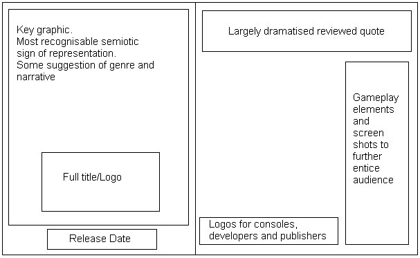
Basic Idea - 2-page spread.This idea is the most simple and straight forward of my two potentials; it follows almost the exact same layout as the Call of Duty advert, however I have chosen to manipulate the blank space that they left. Once again, I have the key graphic filling up the largest area possible on the left side, with the title underneath. This is under the idea that the game I am creating is potentially an incredibly popular one; therefore all the audience needs to see is the left hand page to be drawn into the product. The right side contains far more information and in-game features than all 3 of my examples as in my own experience I prefer everything I might need to know to be in the advert in front of me, I often won't go looking for more information unless I was anticipating the game greatly. I was considering the involvement of the game play footage on the far right panel, as I didn't know if I would have the space or content to fill them, but it's a definite inclusion if I can find the corresponding game play demos.

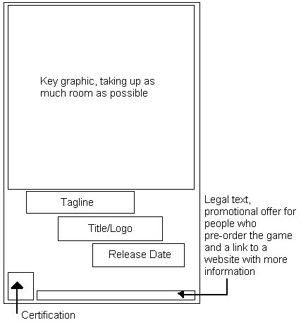
Basic Idea - 1-page spread.Though this advert is only printed on the one page, I want it to contain the same mystery elements of the Halo advertisement I studied. Once again, there will be the large key graphic, title and release date, however this time I plan to involve a tagline to add a sense of horror or tension as the text will only feature as the smallest form on the advert - the main focus will be upon the graphic. This advert unlike the other will contain certifications as it is purely about the RELEASE of the game, and not the game play and review of it; it leads the audience to their own conclusion of the games appeal. Sharing the same idea as Halo, this advert will offer rewards to customers who pre-order or buy special editions of the game, once more this advert is purely for the consumer’s interest and not for marketing and profit.

Though this advert is only printed on the one page, I want it to contain the same mystery elements of the Halo advertisement I studied. Once again, there will be the large key graphic, title and release date, however this time I plan to involve a tagline to add a sense of horror or tension as the text will only feature as the smallest form on the advert - the main focus will be upon the graphic. This advert unlike the other will contain certifications as it is purely about the RELEASE of the game, and not the game play and review of it; it leads the audience to their own conclusion of the games appeal. Sharing the same idea as Halo, this advert will offer rewards to customers who pre-order or buy special editions of the game, once more this advert is purely for the consumer’s interest and not for marketing and profit.

Basic Print Advertisement Features

Based on the 3 research samples I obtained and analysed, a trend seems to follow in the form of what is VITAL on a print advertisement. Here are some mock-up forms of the examples I have collected, and what features are within them and where.

Call of Duty: Black Ops
The most important graphological aspect of this advert would be the key graphic and the title, perhaps because of the video games popularity and hype, any audience would of seen this and been instantly captivated as our eyes tend to look in the top left hand corner of texts first. Interestingly, on the opposite side of the advert, there is a large empty space, which could possibly be used to emphasize the graphic or to draw more attempts to the large font above it reviewing the game. The logos for consoles and production companies are typically small and are at the bottom right of the advert, where the eye is drawn to lastly.

Castlevania
As this is printed on the one page, the same about of legal content is required to be squeezed onto the one feature. However, they have still most importantly got a large area for the main graphic. The traditional 'tagline + title' are bundled closely together with the release date as these are next on what an audience would look for information-wise, but what is noteworthy with this feature would be the separation of the developers logo from the bottom segment. This is a common theme for Konami games as they are a specialised Japanese games developer and often is quite sought out by fans; this is perhaps a method to attract fans of the developers, not just the game series.

Halo: Reach
Out of the 3 this is the most intriguing for me, from a design perspective as well as a content one. Most of the advertisements have large graphics and enough text to fulfil an audience’s need upon reading the advert. However the Halo one features purely an extremely large graphic, the title/logo and small bursts of text across the bottom. Much like the Call of Duty advert, the graphic is the key feature of the entire piece, as the icon is globally recognisable. In some senses, this advert could be seen as lacking as it doesn't meet the requirement to help the reader again knowledge on their product, but what it does achieve is mystery and a want to find out more, so therefore they have included a website for these seeking more. For me, this is perhaps the most interesting print advertisement of them all.

Monday, 28 March 2011

'Castlevania' Print Advertisement


* Vital Elements
Once again, the advertisement features the most important elements much like the previous (title, classification, release date, publisher/developer), however it is important to consider that the advert is only featured on one page. In comparison to the other titles I have studied, ‘Call of Duty’ sold 5.6 million copies in 24 hours, Assassins Creed: Brotherhood sold 6.5 million copies in one week, and lastly Castlevania sold only 1 million copies in just over 2 weeks. Because of the time of release being directly in the middle of 2 very popular game titles, the advertisers knew not to spend overt amounts of advertisements as it would not all pay itself back. Game play elements and quotes can be seen on this feature as it is purely for marketing and popularity boosts, which successfully managed to place it 7th amongst the ‘Most Anticipated Games of 2010’ list on the admired video game content website, Game Trailers.
* Representation
Visual semiotics suggest a represented time period within the 11th century, allowing the impression of old cultures and historically epic narratives to feature fantastical elements of magic and heroism within the game. The masculine lead at the head of the magazine advert boasts a gruff and angry expression and when keyed with the title ‘Lords of Shadow’, the construct of a male orientated representation is suggested.
* Genre
A stereotypical fantasy RPG (Role-Playing Game) because of its combat and levelling techniques, with a further developed idea into adventure and strategy. Though clearly aimed at a male audience, the purpose of the release is to reboot the old Castlevania franchise back into popularity as it once was. This then has primary focus on old fans of the game, as well as attracting newer players with experience within heavily medieval archetypes (Dungeons and Dragons, Elder Scrolls)
* Narrative
The game play screen shot along the bottom of the advert suggest a hand-to-hand or flourishing weaponry style combat game featuring methods of tacticality. The visuals in the advert imply epic battles and quest lines, based within a beautifully picturesque environment – a wholly stereotypical narrative plot for fantasy RPG games. The advert shows no rewards or blurbs for potential customers and no content other than game play screen shots, so it’s solely for media attention.
* Audience
Much like the Halo advert, no large text is involved to persuade the reader into becoming a buyer, just flashy visuals and graphics. This is most likely down the concept behind it being a reboot, as the developers want to show signs of maturity and expansion from their previous game, however research into the title shows that the game itself has minimal links to the previous games. Cleverly, this attracts old fans of the genre, as well as new customers as they are not left in the dark by missing out on the contextual knowledge others might hold.
* Media Language
The reviewed quotes along the top ultimately indicate the games modern approach to innovation, like previously mentioned (‘genre-defying’, ‘3D’). One of the key marketing schemes of the game was to boast the profile surrounding its 3D capabilities as it was one of the first games to ever attempt and successfully release a 3D optional title. It’s also important to notice that the quotes are taken from 2 of the most respected gaming magazines on the market, as their professional opinion would be influential to potential customers – Official Xbox Magazine (which this advert was featured) and Playstation Magazine 3. Within the taglines of the game, ‘repetition of the word ‘dark’ suggests a fight against morality and justice, once again highly typical for a fantasy game. The layout of the advert defines the character as locations as primary elements of the games and centrally key to the plot.

'Halo: Reach' Print Advertisement


* Vital Elements
This advert contains the requirements for a full title and release date, certification and logos for its platformed console/developer/publisher, however does not offer a reviewed quote from a respected magazine or person. This is because the game has not yet been released to the public, or even to reviews, so instead a blurb is detailed along the bottom to set-up the narrative within the game. No game play clips allows the audience to become further mystified by the advertisement as they know nothing from inside the game, allowing for ‘buzz’ and interest to build.
* Representation
Gender placement can be seen as difficult to label as the figures in the advert are in space suits, however their key features model their masculine body builds as well as boasting large and powerful weaponry. Through the study of Semiotics, other focus signs such as their description as heroes in the ‘Noble Team’, suggest a hier-achetypal male idol with great power. By using an unfamiliar location and sci-fi-esque character types, the audience is drawn into its pseudo-reality and somehow finds their own representation within it. Though no narrative elements are portrayed, more semiotical signs evaluate the famous ‘Master Chief’ character, as well as the space environment and ‘Halo’ logo so old fans can instantly recognise the newest release. Aimed at a predominately male, potentially off the back of other popular FPS titles such as ‘Call of Duty’, the new addition of a female character in the advertisement opens the new representation and audience to females.
* Genre
In terms of direct Taxonomy classification, Halo: Reach is an ultimately an action game, which can then be subcategorized into adventure/shooter or even strategy. It’s seen as an ‘FPS set in space’ as the characters are wearing alien-style suits of armour and out-landish guns. Former Halo enthusiasts will be drawn to the newest title of the most successful video game series because of its similarities to past titles, however through explosive use of visual action and adventure in the advertisement, new fans can begin to expect what the narrative will entail.
* Narrative
As suggested by the genre, the narrative will involve various degrees of action/fighting and potentially co-operation as a ‘squad’ of soldiers can be seen. By reading into the smaller texted blurb and learning the idea of playing as part of a team, the advert becomes purely for narrative constructs and not so much marketing. As barely any new information for fans is deployed, it can be considered that this advertisement is to cause buzz and hype just through the mere suggestion of a new Halo title.
* Audience
This advert was scanned from the popular gaming magazine OXM (Official Xbox Magazine), which features Xbox exclusive content only. The appearance of this advertisement is strategically placed as Halo: Reach is an Xbox-only title, so it’s large, double page spread will directly influence customers who have shared contextual knowledge of the game. Because of the ‘entertainment’ value of the magazine and gaming industry, the advert aims for casual but content specific audiences, so the advert features no large amounts of text, just impressive visuals as an aid to purchase.
* Media Language
The use of hyperbolic modifiers to excites the reader(‘legend’, ‘overwhelming’, ‘elite’, ‘massive’) gives the audience a deeper and more enthusiastic anticipation to discover more, and for this a website address is provided for those seeking more information. Rewards in the form for Halo fans who pre-order the title entice a specific fan base and audience. Most importantly, the legal text below aims to protect claims within the advertisement, as well as the signs and logos used.