Basic Idea - 2-page spread.
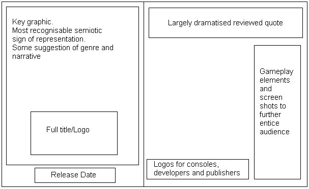
 This idea is the most simple and straight forward of my two potentials; it follows almost the exact same layout as the Call of Duty advert, however I have chosen to manipulate the blank space that they left. Once again, I have the key graphic filling up the largest area possible on the left side, with the title underneath. This is under the idea that the game I am creating is potentially an incredibly popular one; therefore all the audience needs to see is the left hand page to be drawn into the product. The right side contains far more information and in-game features than all 3 of my examples as in my own experience I prefer everything I might need to know to be in the advert in front of me, I often won't go looking for more information unless I was anticipating the game greatly. I was considering the involvement of the game play footage on the far right panel, as I didn't know if I would have the space or content to fill them, but it's a definite inclusion if I can find the corresponding game play demos.
Basic Idea - 1-page spread.Though this advert is only printed on the one page, I want it to contain the same mystery elements of the Halo advertisement I studied. Once again, there will be the large key graphic, title and release date, however this time I plan to involve a tagline to add a sense of horror or tension as the text will only feature as the smallest form on the advert - the main focus will be upon the graphic. This advert unlike the other will contain certifications as it is purely about the RELEASE of the game, and not the game play and review of it; it leads the audience to their own conclusion of the games appeal. Sharing the same idea as Halo, this advert will offer rewards to customers who pre-order or buy special editions of the game, once more this advert is purely for the consumer’s interest and not for marketing and profit.
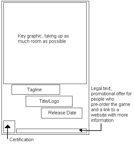
Though this advert is only printed on the one page, I want it to contain the same mystery elements of the Halo advertisement I studied. Once again, there will be the large key graphic, title and release date, however this time I plan to involve a tagline to add a sense of horror or tension as the text will only feature as the smallest form on the advert - the main focus will be upon the graphic. This advert unlike the other will contain certifications as it is purely about the RELEASE of the game, and not the game play and review of it; it leads the audience to their own conclusion of the games appeal. Sharing the same idea as Halo, this advert will offer rewards to customers who pre-order or buy special editions of the game, once more this advert is purely for the consumer’s interest and not for marketing and profit.