Call of Duty: Black Ops
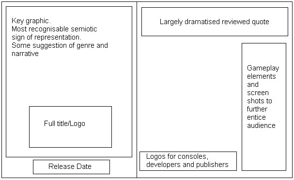
The most important graphological aspect of this advert would be the key graphic and the title, perhaps because of the video games popularity and hype, any audience would of seen this and been instantly captivated as our eyes tend to look in the top left hand corner of texts first. Interestingly, on the opposite side of the advert, there is a large empty space, which could possibly be used to emphasize the graphic or to draw more attempts to the large font above it reviewing the game. The logos for consoles and production companies are typically small and are at the bottom right of the advert, where the eye is drawn to lastly.
Castlevania

As this is printed on the one page, the same about of legal content is required to be squeezed onto the one feature. However, they have still most importantly got a large area for the main graphic. The traditional 'tagline + title' are bundled closely together with the release date as these are next on what an audience would look for information-wise, but what is noteworthy with this feature would be the separation of the developers logo from the bottom segment. This is a common theme for Konami games as they are a specialised Japanese games developer and often is quite sought out by fans; this is perhaps a method to attract fans of the developers, not just the game series.
Halo: Reach

Out of the 3 this is the most intriguing for me, from a design perspective as well as a content one. Most of the advertisements have large graphics and enough text to fulfil an audience’s need upon reading the advert. However the Halo one features purely an extremely large graphic, the title/logo and small bursts of text across the bottom. Much like the Call of Duty advert, the graphic is the key feature of the entire piece, as the icon is globally recognisable. In some senses, this advert could be seen as lacking as it doesn't meet the requirement to help the reader again knowledge on their product, but what it does achieve is mystery and a want to find out more, so therefore they have included a website for these seeking more. For me, this is perhaps the most interesting print advertisement of them all.
No comments:
Post a Comment